Moving into any new space is incredibly exciting. And daunting. So many blank walls, empty rooms, and the best part... interior design options! It’s easy to get overwhelmed, but Simply Framed has you covered. Here are some inspiring before and after photos to help you re-imagine your space.
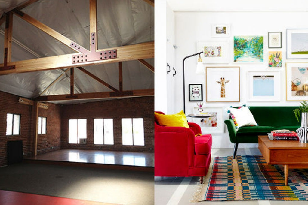
When we worked with Joy Cho to custom frame some of her prints earlier this year we were over the moon. The below images photographed by Zeke Ruelas are further evidence as to why. For a lot of us, our office is a second home. When Joy moved into her new space, she teamed up with Emily Henderson for a before and after that takes our breath away.

All of the DIY tips and tricks of this makeover are broken down on Cho's blog Oh Joy. To achieve a similar look, our white, black, and light walnut gallery frames will do the trick.
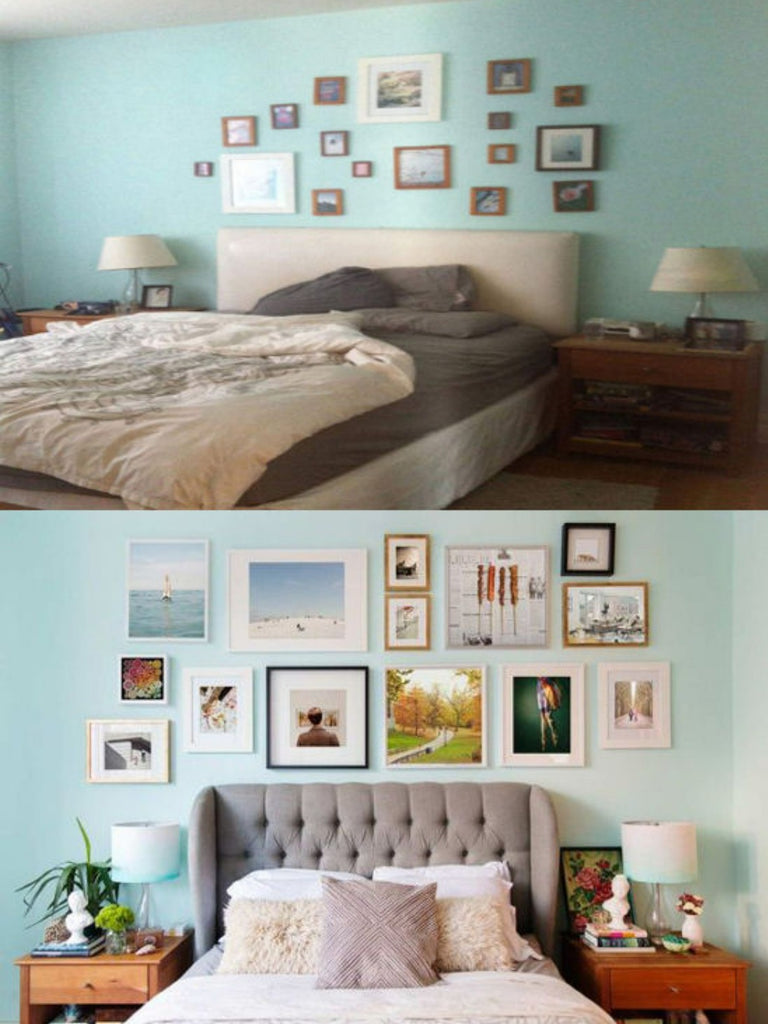
The next before and after, photographed by Lisa Weatherbee, shows what a major difference a minor update can have. Often, a new space isn't going to be completely new but with a little TLC it can feel like one. The tiny pictures are too hard to see and the layout feels messy.

Selecting larger pieces helps draw the eye in a positive way, and using similar frame styles is always the best go-to for keeping a gallery wall with different sized artwork cohesive. Need help with the layout? Our gallery wall guide has all the tips and tricks needed for a DIY gallery wall, from planning and layout to hanging the art.
Feeling inspired? Now that you know what you want to do in your new apartment, home, or office you can find even more great hanging tips on Simply Framed’s how to hang board on Pinterest.
For help designing the gallery wall of your dreams, contact us at hello@simplyframed.com

